

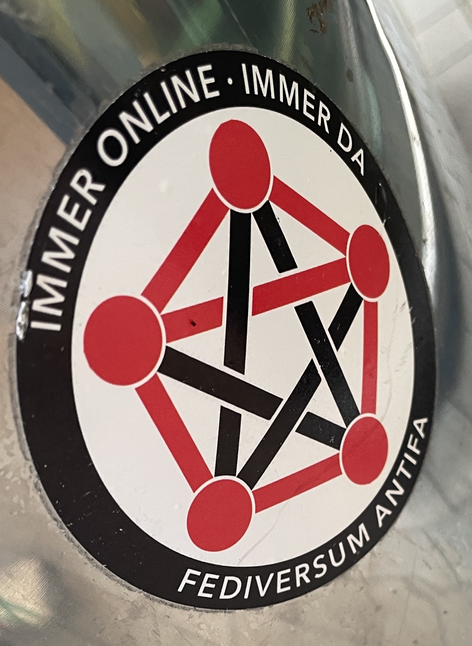
Seeing the fediverse logo in Antifa colours made me chuckle
You must log in or register to comment.
This color scheme makes it look like some satanist organization. I love it!
And here my ass thought it was the only other UGA football fan on Lemmy besides me
Ok thats sick af.
Why are all the inner lines black but one? I hate it.
Also it makes it look like basically all actual instances (circles) are fascist (red)?
Also, are antifascists the terminally online ones? But maybe there’s a language context nuance that I’m missing!?
Nice thought (supporting antifa) imho, but odd execution.
The red is probably for communism, the colours are the same as the anarcho-communism flag. Personally, I’ve always associated fascism with black, no idea why.
The swastika on German Nazi flags were black. Of course they also were mostly red (and had a white circle).
Red, white, and black is definitely a choice though. Maybe picking a color that wasn’t on the Nazi flag would have been better for this sticker.
That’s just the colours of regular AntiFa stickers:

i mean i’m pretty sure the nazis chose those colours specifically to benefit from being associated with socialism, the party’s full name is literally the “national socialists” after all, the whole thing about nazism is taking something popular and using it for evil.
I more associate them with brown anyways, that’s way more unique to fascism. EVERYONE uses red white and black, they’re literally the first colours every language creates words for.
Anarchy A?
But wouldn’t three of the lines need to be red for that? Something like this:

yeah i like that a lot more, kinda want to make the dots black though, feels like that contrast makes it a bit easier to see the A and generally looks better.

Not sure how but you made an abstract logo look like a leatherdaddy. Excellent work.
hm, yeah i don’t see it, perhaps you think more about leatherdaddies than most people?


