
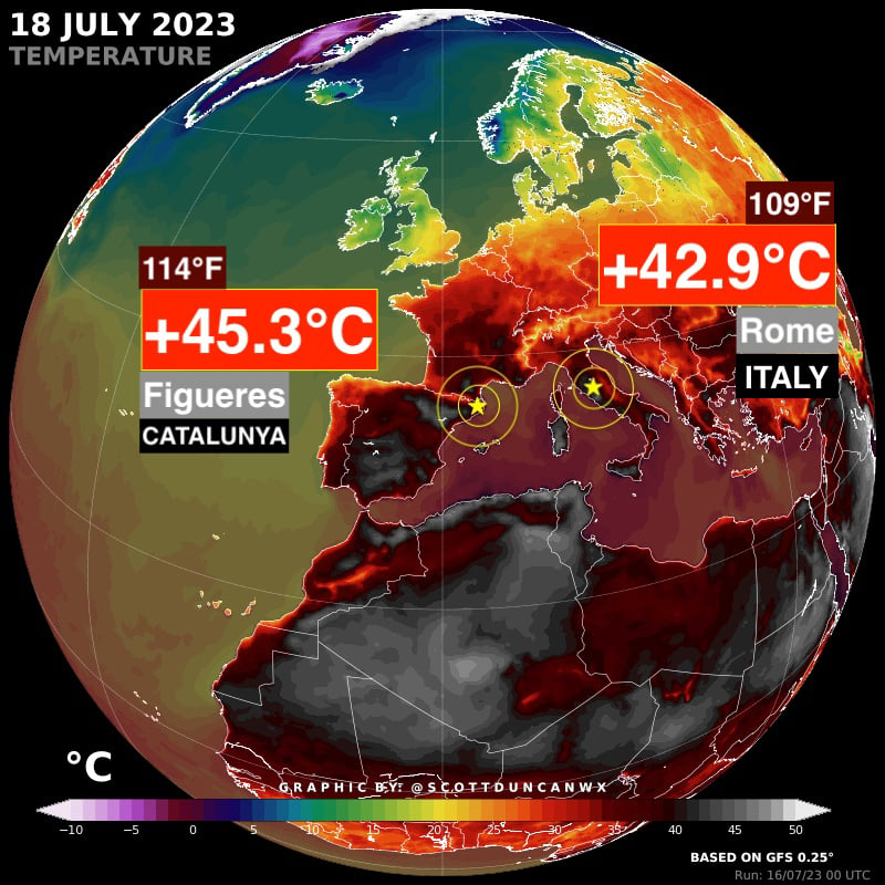
Hottest day on record for Rome, Italy with 42.9°C
Also hottest day on record for Catalonia with a searing 45.3°C.
You must log in or register to comment.
Meanwhile Africa:

Only the part north of the equator, though ;) That said, these Winter temperatures are a bit weird (Klerksdorp):

edit: Wife (who’s from that town) says this is not actually weird. Desert climate, so it always gets warm while the sun is out, but usually only for a short time.
Hottest day on record, for now.
Hottest summer so far – coldest (approximately) for the rest of our lives…

45 °F (~7° C) in the middle of July would hardly be an indicator for a stable climate either.
ICE AGE! ICE AGE! ICE AGE!
Meanwhile, in Northern Germany: This is a pleasant and acceptable summer.
Here in Lübeck, the forecast for the next 2 weeks is 20-22 C, in Flensburg it’s a bit colder with 18-19 C
For everyone in the South: Schleswig-Holstein is a great tourism location, just bring rain clothes ;)
In the Netherlands it’s like +20… I would appreciate some sun honestly
Today it’s a bit gray, but yesterday we had several hours of sun :)
West coast of Norway looking pretty nice right about now.
Greenland has Costco right
I’m in the Faroe islands right now. No other tourists, 11C, bit windy though. Highly recommended.
The only con is you’re stuck on the Faroe islands.
How exactly am I stuck here?
I’m just fucking with you. Faroe islands are great.
I was wondering if there’d been another Icelandic volcano eruption disrupting air traffic I’d missed 😅. Apparently there’s been one last week but that was fairly minor
It’s cold af there right now according to that model
That map is for air temperature right? Since it shows way higher temperatures for Portugal than the ones actually given by the weather stations. For example it’s showing 30+ for zones that didn’t hit even close to that, worse even were cloudy today.
Edit: Also odd that the iOS app for those locations don’t throw these maximums.
Where did that weather data come from? (scratch this)
Edit2: saw that it’s based on the GFS model. I’ve seen some criticisms regarding using that for other than US since that model accuracy is quite low.
Can you share a map with your preferred model? Just curious to see how much difference that would make.
Don’t have any, and curious to know why this map was based on GFS.
You can however check the ipma (Portuguese weather institute) to know the actual temperatures and the actual predictions based on models employed here.
Also important to know Italy and Greece are suffering from abnormal temperatures while Portugal is not due to the Azores anti cyclone.
Still, according to the my iOS app I those two cities don’t have the (maximum) temperatures shown in that map.
What’s this measurement in hamburgers, the true freedom unit?
Medium rare
Fahrenheit is listed above the Celsius in a smaller font upper left (edit: upper left for Catalonia upper right for Italy)
I know I know. Just trying to inject some humor in an otherwise abysmal forecast for the future my kids will live in.


