Fortunately, my russian teacher wrote “normally”, while I had to deal with basically this mess in German, where you only could separate the u from the n and the w from the m by the lines below the u and w.
Yet, Sütterlin looks different, as it often has vertical and diagonal straight lines where Latin script has round shapes. But likewise, it’s difficult to read.


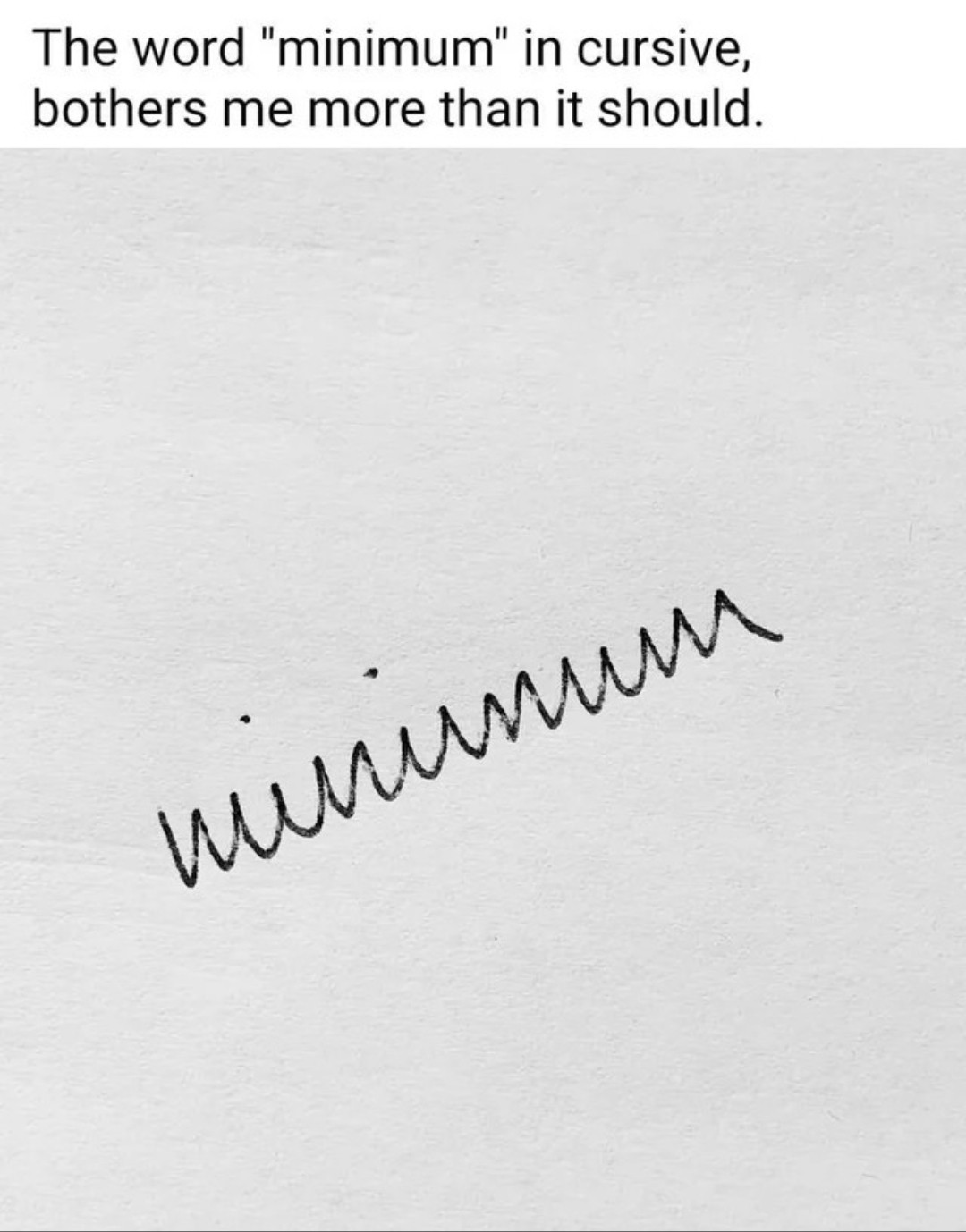
You can make it much more legible by just curving the parts that are susposed to be curved and not just doing jagged edges everywhere.
Strictly based on where the jagged points are and where the strokes end, I would say the word written was uůẃnwu.
Looks like vùnunww to me.
Also yeah you got it quite well.
winumwm
deleted by creator
Yeah you just described the correct and the incorrect way.
there are many ways to write cursive and differs per country .
I’m not even sure which method I’m taught. There’s “Methode D’haese” and “Karakter” (a modern method).
It’s called writing garlands and is a mess for obvious reasons.
Yeah it makes it look like russian cyrilic cursive. That one actually is supposed to have more letters look that way.
Or the Serbian one.
Like this
Fortunately, my russian teacher wrote “normally”, while I had to deal with basically this mess in German, where you only could separate the u from the n and the w from the m by the lines below the u and w.
That’s a feature of a very old German hand writing style that hasn’t been used much since WWII
Yet, Sütterlin looks different, as it often has vertical and diagonal straight lines where Latin script has round shapes. But likewise, it’s difficult to read.
You’re ruining the meme
Edit: didn’t think I needed this: /s
Cannot ruin a bad faith argument. I can also write chickenscratch and fast but it still looks more legible than that.